 Phase 1 MVP design
 Every screen.
Built for performance.
A complete walkthrough of the Raxon Phase 1 MVP — from splash to share card. Every screen is designed around one goal: make real skill visible.
Open the app.
Enter the game.
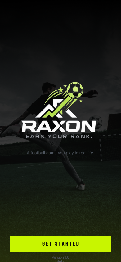
The splash screen sets the tone immediately — dark, confident, electric. The Raxon logo dominates with a clear brand promise before the player ever touches a challenge.
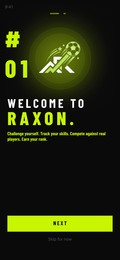
Onboarding explains the concept in a single scroll. No friction. No lengthy sign-up walls. The player understands the game before they're asked to commit.
- Immediate brand signal
- Single-tap to get started
- Concept clear in under 10 seconds
Sign in.
Claim your profile.
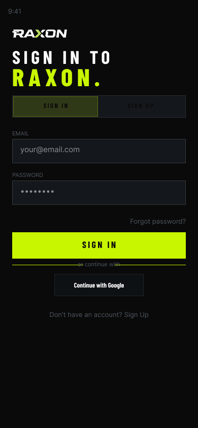
Clean sign-in with email or Google. No noise, no upsells — just entry. From this screen the player gets a persistent identity that tracks every challenge, every XP point, and every rank movement.
- Email + Google auth
- Tab toggle: sign in / sign up
- Minimal field count — low drop-off
Your rank.
Your progress.
Your next move.
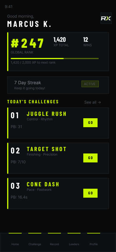
The home dashboard is the emotional core of the app. The player's global rank is the first number they see — not followers, not likes. Pure performance.
XP progress, win count, streak status, and today's challenge list are all visible above the fold. Everything pushes toward one action: compete.
- Global rank — front and centre
- XP bar with next-rank target
- Active streak tracker
- Today's 3 challenges with personal bests
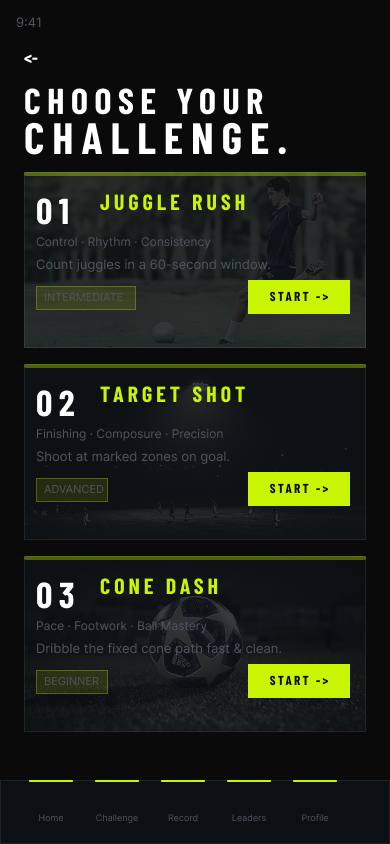
Choose the drill.
Then perform.
Three challenges at launch — Juggle Rush, Target Shot, and Cone Dash. Each card shows skill tags, difficulty level, and a direct "START →" action. No dead ends. No confusion about what to do next.
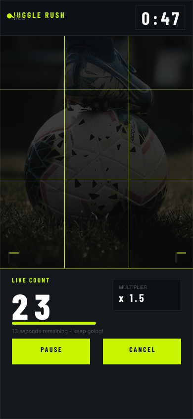
During the challenge, the interface gets out of the way. A live count, a timer, and a multiplier. The camera is the only thing that matters.
- Juggle Rush · Target Shot · Cone Dash
- Difficulty badges: Beginner / Intermediate / Advanced
- Live count + multiplier overlay during recording
- Pause / cancel at any point
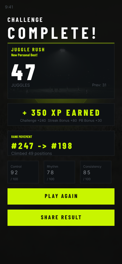
Challenge complete.
Rank earned.
The result screen is the highest-emotion moment in the product. A large score, a new personal best flag, XP earned with a clear breakdown, and a rank movement number that tells the player exactly how far they climbed.
Sub-scores for Control, Rhythm, and Consistency give real feedback — not just a number, but a mirror of how they actually played.
- Large, dominant score display
- New PB flag when the player beats their best
- XP breakdown: challenge + streak + PB bonuses
- Rank movement: old rank → new rank
- Sub-scores for every skill dimension
Your rank
against the world.
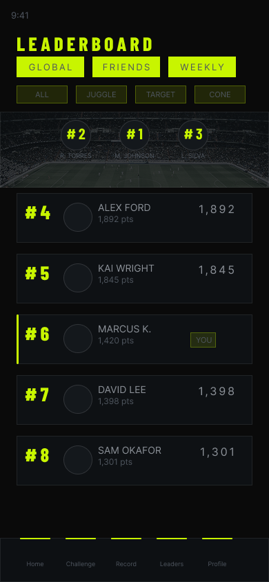
The leaderboard shows the player exactly where they stand among everyone competing. Podium positions at the top, with a highlighted "YOU" row that follows the player's current position regardless of scroll depth.
Filter by Global, Friends, or Weekly. Drill into Juggle, Target, or Cone sub-leaderboards. Every view answers the same question: am I improving?
- Podium visual for top 3 positions
- Global / Friends / Weekly tabs
- Challenge-specific filters
- Player's own row always highlighted
A public profile
built on real skill.
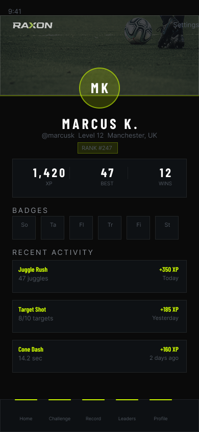
The player profile is the persistent identity Raxon builds around performance. Rank, XP, best scores, badges earned, and a full recent activity log — all visible to anyone who sees the profile.
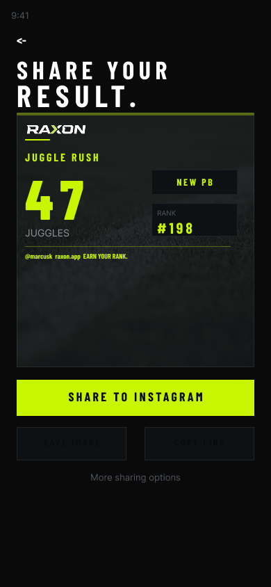
Share Card takes the result and turns it into a shareable asset optimised for Instagram. The player's name, score, new PB flag, and rank — in one clean image that spreads the Raxon brand every time it's posted.
- Level, rank, XP, wins — all on one screen
- Badge grid reflecting skill history
- Recent activity feed with XP earned per session
- One-tap share to Instagram with branded card
All 10 screens at a glance.
The game is designed. Now let's ship it.
Every screen is scoped and sequenced. The habit loop is defined. Reach out to bring Phase 1 to market.